How to Truly Understand Graphs Without Memorizing Formulas
Mathematics
Hi there!
As someone who struggled with graphing functions in high school, I totally understand the "What is this graph even trying to say?" frustration. A sea of formulas, turning points, and transformations often felt like a math nightmare. But then, I had an epiphany: instead of memorizing formulas, why not learn to see graphs as stories unfolding?
In this post, I’ll share my tips to help you visualize function graphs and truly understand their meaning—no rote memorization is required.
1. Think of Graphs as Stories Between "x" and "y"
Every graph is like a visual tale that describes how changes in the input x affect the output y=f(x).
For example:
For linear functions (y=mx+c), the story is simple: a steady relationship. The graph is a straight line, and the relationship doesn’t have any surprises.
For quadratic functions (y=ax^2+bx+c), things get more interesting. These graphs often form a parabola, a story with a peak or a low point—a dramatic climax.
Personal tip: When studying quadratic graphs, I imagine throwing a ball into the air and watching its path. This small mental image makes parabolas easier to grasp.
2. Start With Key Points Before Drawing the Whole Graph
Instead of trying to sketch the entire graph from scratch, focus on critical points first:
Y-intercept: Set x=0 and solve for y.
X-intercept(s): Set y=0 and solve for x.
For example: In y = x^2 - 4, setting y=0y = 0y=0 gives x=±2, meaning the graph crosses the x-axis at (−2,0) and (2,0).
Personal tip: I think of these points as “landmarks” on the graph—like placing pins on a map before drawing the route.
3. Focus on Turning Points and Intervals
Turning points: For quadratic functions, the vertex (or turning point) is at x=−b/2a. Once you find the x-coordinate, plug it back into the equation to get the y-coordinate.
Intervals: Check whether the graph increases or decreases by substituting values on either side of the turning point.
Example: For y = x^2 - 4x + 3, the turning point is at x=2 and y=−1, so the graph has a peak (or dip) at (2,−1).
Personal tip: Use colored pens to highlight these important points—this adds clarity and even makes studying feel a bit creative.
4. Use Tools to Visualize
One of my favorite tools is the Desmos Graphing Calculator, a free and intuitive platform for graphing functions.
Experiment with graph transformations: Try adding or subtracting constants (e.g., +3 or −2) to see how the graph shifts vertically.
Adjust slopes: Compare y=x with y=2x to observe how steepness changes.
Personal tip: I spent hours tweaking graphs on Desmos just to see how they transformed. It was the turning point in making graphs feel less abstract and more engaging for me.
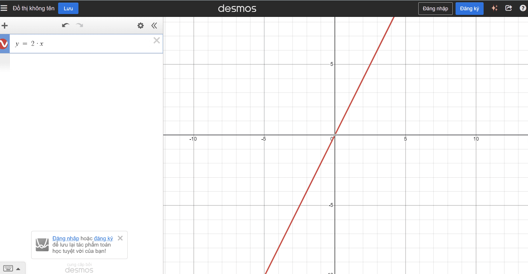
Image 1. Example of a function y = 2x in Demos
5. Relate Graphs to Real Life
Graphs are more than just mathematical visuals—they connect to real-life situations:
An upward-sloping graph could represent the growth of social media users.
A parabola might illustrate the path of a soccer ball in flight.
Personal tip: I often ask myself, “If this graph were a story, what would it be describing?” It helps me visualize graphs in a way that feels relatable.
Conclusion
Graphs aren’t just curves and lines—they’re dynamic stories about the relationship between variables. Once you start seeing them this way, they become much easier (and more fun!) to understand.
Next time you’re faced with a graph, stop and think:
What are the key points?
What kind of story is this graph trying to tell?
And don’t forget, tools like Desmos are always there to guide you. Give it a shot, and start seeing the magic of math through your own lens!
Happy learning!
From someone who used to fear graphs but now loves them.


Am I Suitable ?
I would love to collaborate with you! Whether it is launching something new or improving what you already have, I’m here to help transform your vision into a successful reality.
Let’s make it happen!
Have a nice day!
Thanks for visiting my house!
Contact
Ritaniemenkatu, Lahti 15240, Finland
(+358) 46 583 3980